![[PukiWiki]](image/pukiwiki.png "[PukiWiki]")
概要 †ここでは @grafana/create-plugin を使用して Grafana のパネルプラグインの開発手順を記載する。 目次 †
開発環境の構築 †開発者ガイドに従って以下をセットアップする。
Mac brew install git brew install go brew install node@18 npm install -g yarn Windows 雛形の作成 †ここでは sample1 という名前で パネルプラグインを作成した。 npx @grafana/create-plugin@latest
Need to install the following packages:
@grafana/create-plugin@1.10.1
Ok to proceed? (y) y
npm WARN deprecated urix@0.1.0: Please see https://github.com/lydell/urix#deprecated
npm WARN deprecated source-map-url@0.4.1: See https://github.com/lydell/source-map-url#deprecated
npm WARN deprecated resolve-url@0.2.1: https://github.com/lydell/resolve-url#deprecated
npm WARN deprecated source-map-resolve@0.5.3: See https://github.com/lydell/source-map-resolve#deprecated
? What is going to be the name of your plugin? sample1
? What is the organization name of your plugin? my
? How would you describe your plugin? sample panel
? What type of plugin would you like? panel
? Do you want to add Github CI and Release workflows? No
? Do you want to add a Github workflow for automatically checking "Grafana API compatibility" on PRs? No
✔ ++ /Users/xxxxxxx/Desktop/Iot/develop-grafana-plugin/my-sample1-panel/README.md
✔ ++ /Users/xxxxxxx/Desktop/Iot/develop-grafana-plugin/my-sample1-panel/src/components/SimplePanel.tsx
:
✔ updateGoSdkAndModules
✔ printSuccessMessage Congratulations on scaffolding a Grafana panel plugin! 🚀
## What's next?
Run the following commands to get started:
* cd ./my-sample1-panel
* npm install to install frontend dependencies.
* npm run dev to build (and watch) the plugin frontend code.
* docker-compose up to start a grafana development server. Restart this command after each time you run mage to run your new backend code.
* Open http://localhost:3000 in your browser to create a dashboard to begin developing your plugin.
Note: We strongly recommend creating a new Git repository by running git init in ./my-sample1-panel before continuing.
* View create-plugin documentation at https://grafana.github.io/plugin-tools/
* Learn more about Grafana Plugins at https://grafana.com/docs/grafana/latest/plugins/developing/development/
npm notice
npm notice New minor version of npm available! 9.5.1 -> 9.8.1
npm notice Changelog: https://github.com/npm/cli/releases/tag/v9.8.1
npm notice Run npm install -g npm@9.8.1 to update!
npm notice
生成されるソース †grafana/create-plugin の場合は grafana/toolkit と違い、ビルド時に grafana/create-plugin は経由せずに直接 webpack、tsc を用いてビルドされる。 尚、生成(scaffold)されるソースは以下の通り。 ├── CHANGELOG.md ├── LICENSE ├── README.md ├── cypress ├── cypress.json ├── dist ├── docker-compose.yaml ├── jest-setup.js ├── jest.config.js ├── node_modules ├── package-lock.json ├── package.json ├── provisioning ├── src | ├── README.md | ├── components | │ └── SimplePanel.tsx (パネルコンポーネント) ※react の関数コンポーネント | ├── img | │ └── logo.svg | ├── module.ts (パネルオプションの定義) | ├── plugin.json | └── types.ts. (各パネルオプションのデータ型の定義) └── tsconfig.json そのままビルド/動作確認してみる †各ソースの解説は後に行う事とし、まずはそのままビルドして動かしてみる。 対象バージョンの設定 †docker-compose の Grafanaバージョン等を対象のバージョンに書き換える。(または 環境変数 GRAFANA_IMAGE、GRAFANA_VERSION を設定する) grafana_image: ${GRAFANA_IMAGE:-grafana-oss}
grafana_version: ${GRAFANA_VERSION:-8.5.27-ubuntu}
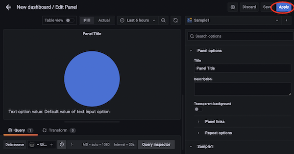
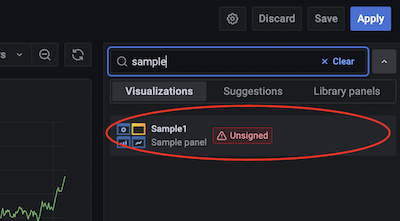
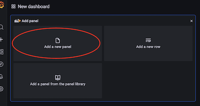
ビルド †cd my-sample1-panel npm install npm run build 起動 †# docker-compose-plugin を使用している場合は、「docker compose up」 docker-compose up サンプルダッシュボード作成 †http://localhost:3000 にアクセスして ダッシュボード作成し、いま作成したパネルプラグインを動かしてみる。
→
→
→
→
コンポーネント引数の概要 †パネル本体のソースは SimplePanel.tsx として生成されており、React の関数コンポーネントとなっている。 生成されたソースにデフォルトで展開される引数は以下の4つだけだが、PanelProps には他にもいくつかのプロパティが定義されており、必要に応じて利用できる。
import React from 'react';
import { PanelProps } from '@grafana/data';
import { SimpleOptions } from 'types';
import { css, cx } from '@emotion/css';
import { useStyles2, useTheme2 } from '@grafana/ui';
    :
interface Props extends PanelProps<SimpleOptions> {}
    :                                                                   // ↓
export const SimplePanel: React.FC<Props> = ({ options, data, width, height }) => {
  const theme = useTheme2();
  const styles = useStyles2(getStyles);
  return (
    <div
      className={cx(
     :
コンポーネント引数(data) †コンポーネント引数の data からはクエリデータや読み込み状況などが取得できる。 以下に取得できる主な値を記載する。
data.state †パネルの読み込み状態を指す文字列が返される。(NotStarted, Loading, Streaming, Done, Error のいずれか(※) data.request †API呼び出し時の要求データが返される。 data.requestのサンプル {
"app": "dashboard",
"requestId": "Q100",
"timezone": "browser",
"panelId": 2,
"dashboardId": 1,
"range": {
"from": "2023-04-01T02:03:44.323Z",
"to": "2023-04-01T08:03:44.323Z",
"raw": {"from": "now-6h", "to": "now"}
},
"timeInfo": "",
"interval": "15s",
"intervalMs": 15000,
"targets": [
{
"refId": "A",
"datasource": {
"type": "datasource",
"uid": "grafana"
},
"queryType": "randomWalk"
}
],
"maxDataPoints": 1432,
"scopedVars": {
"__interval": {
"text": "15s",
"value": "15s"
},
"__interval_ms": {
"text": "15000",
"value": 15000
}
},
"startTime": 1704528224323,
"rangeRaw": {
"from": "now-6h",
"to": "now"
},
"endTime": 1704528224331
}
data.timeRange †data.timeRangeのサンプル {
"from": "2023-04-01T02:07:08.268Z",
"to": "2023-04-01T08:07:08.268Z",
"raw": {
"from": "now-6h",
"to": "now"
}
}
data.series †
data.series のサンプル [
{
"refId": "A",
"fields": [
{
"name": "time",
"type": "time",
"typeInfo": {"frame": "time.Time", "nullable": true},
"config": {
"interval": 15000,
"thresholds": { "mode": "absolute", "steps": [{"value": null, "color": "green"}, {"value": 80, "color": "red"}] },
"color": {"mode": "thresholds"}
},
"values": [
1704507239849,
1704507254849,
1704507269849,
1704507284849,
1704528299849
],
"entities": {},
"state": {
"scopedVars": { "__series": { "text": "Series", "value": {"name": "Series (A)"} }, "__field": { "text": "Field", "value": {} } },
"seriesIndex": 0
}
},
{
"name": "A-series",
"type": "number",
"typeInfo": {"frame": "float64", "nullable": true},
"labels": {},
"config": {
"mappings": [],
"thresholds": { "mode": "absolute", "steps": [{"value": null, "color": "green"}, {"value": 80, "color": "red" }] },
"color": {"mode": "thresholds"}
},
"values": [
21.39141804533429,
21.269982656049816,
21.409325409660905,
21.27445038763838,
21.571137801382193
],
"entities": {},
"state": {
"scopedVars": { "__series": {"text": "Series", "value": {"name": "Series (A)"} }, "__field": {"text": "Field", "value": {} } },
"seriesIndex": 0,
"range": {"min": 20.043626241840062, "max": 33.74705135437393, "delta": 13.703425112533868}
}
}
],
"length": 5
}
]
標準オプション設定を有効にしているパネルの場合の注意 †標準オプション設定(※1)を有効にしているパネルの場合、データフレームの値をそのまま画面に表示してしまうと、オプション設定が反映されていない素の値が表示されてしまう。 ※1 オプションについては後述 以下に display の使用例を記載する。 import React, { useState } from 'react';
import { PanelProps } from '@grafana/data';
import { SimpleOptions } from 'types';
interface Props extends PanelProps<SimpleOptions> {}
export const SampleTable: React.FC<Props> = ({ options, data, width, height }) => {
// データ取得日時
const [lastTime, setLastTime] = useState(0);
// 表示用データ
const [rows, setRows] = useState([]);
// 項目名リスト
const [columns, setColumns] = useState<string[]>([]);
const getRows = (frame: any) => {
let rows: any = [];
let columns: string[] = [];
frame.fields.map((f: any) => {
const name = f.name;
columns.push(name);
f.values.map((v: any, i: number) => {
let row: any = {};
if (i < rows.length) {
row = rows[i]
} else {
rows.push({});
}
// 素の値は使用しない
// row[name] = v;
// display メソッドで得られたテキスト値に、接頭/末尾文字を付加したものを表示する。
const dispValue = f.display!(v);
const prefix = dispValue.prefix || '';
const suffix = dispValue.suffix || '';
row[name] = prefix + dispValue.text + suffix;
rows[i] = row;
});
});
return [columns, rows];
};
if (data.state === "Done" && data?.request?.endTime !== lastTime) {
setLastTime(data?.request?.endTime || 0);
const result = getRows(data.series[0]);
setColumns(result[0]);
setRows(result[1]);
}
return (
<div style={ {height: height, overflowY: 'scroll'} }>
<div>count: {rows ? rows.length : 0}</div>
<div>start</div>
<table style={{border: '1px solud #fff', borderCollapse: 'collapse'}}>
{rows
? rows.map((row: any, i: number) => {
const data = columns.map((name) => {
return <td key={`{name}_{i}`} style={{border: '1px solid #fff', padding: 4}}>{row[name]}</td>
})
return <tr key={`row_{i}`}>{data}</tr>
})
: null}
</table>
<div>end</div>
</div>
);
};
パネルから Variables を取得/変更する †Variables値の取得 †コンポーネント引数から取得した replaceVariables 関数を利用する // replaceVariables の引数に指定した文字列の "$variable名" の部分が実際のVariableの値に置換される
let value = replaceVariables('$text1')
console.log('text1 の値は ' + value + ' です');
Variables値の変更 †@grafana/runtime の locationService を利用する。 例) // partial メソッドで一部の Variablesの変更が可能。
// variablesのURLパラメータ名の接頭文字には "var-" が付与される為、注意。
locationService.partial({'var-text1': '変更後の値'}, true)
サンプル import React, { useRef } from 'react';
import { PanelProps } from '@grafana/data';
import { Button, InlineField, Input } from '@grafana/ui';
import { locationService } from '@grafana/runtime';
import { SimpleOptions } from 'types';
interface Props extends PanelProps<SimpleOptions> {}
export const SampleChangeVariables: React.FC<Props> = ({ options, data, width, height, replaceVariables }) => {
const refName = useRef<HTMLInputElement>(null);
const refValue = useRef<HTMLInputElement>(null);
const getVariables = (varName: string) => {
return replaceVariables('$' + varName) || '';
};
const updateVariables = (varName: string, value: any) => {
let data: any = {};
data['var-' + varName] = value;
locationService.partial(data, true);
};
return (
<div>
<div>
<InlineField label="Variablesの名前">
<Input ref={refName} name="targetName" />
</InlineField>
<InlineField label="Variablesの値">
<Input ref={refValue} name="targetValue" />
</InlineField>
</div>
<Button
size="md" variant="success" fill="outline" tooltipPlacement="top"
onClick={()=>{
let targetName = refName?.current?.value;
if (targetName) {
refValue!.current!.value = getVariables(targetName);
}
}}>
<div>Variablesを取得</div>
</Button>
<Button
size="md" variant="success" fill="outline" tooltipPlacement="top"
onClick={()=>{
let targetName = refName?.current?.value;
if (targetName) {
updateVariables(targetName, refValue?.current?.value);
}
}} >
<div>Variablesを変更</div>
</Button>
</div>
);
};
プラグインから任意のSQLを発行する †@grafana/runtime の getBackendSrv を利用すればプラグイン処理から直接SQLの発行(APIリクエスト)を行う事ができる。 サンプル import React, { useState } from 'react';
import { PanelProps, toDataFrame } from '@grafana/data';
import { Button } from '@grafana/ui';
import { config, getBackendSrv } from '@grafana/runtime';
import { SimpleOptions } from 'types';
interface Props extends PanelProps<SimpleOptions> {}
export const SampleCallApi: React.FC<Props> = ({ options, data, width, height, replaceVariables }) => {
// 項目名リスト
const [fieldNames, setFieldNames] = useState<string[]>([]);
// 表示データ
const [rows, setRows] = useState([]);
// SQLの発行先のデータソース名
const dsName = 'sampledb';
// バックエンドAPI呼び出し
const callApiTest = () => {
// クエリID(多分パネルに設定するIDと被りさえしなければ良い)
const queryId = 'custom_query';
// データソースリクエストに必要なデータソースIDはconfigから取得する
const dsId = config.datasources[dsName]['id'];
// 発行するSQL
const rawSql = 'select * from books order by id';
let data = {
queries: [
{
refId: queryId,
rawSql: rawSql,
format: 'table',
datasourceId: dsId,
}
],
};
getBackendSrv().datasourceRequest({
method: 'POST',
url: '/api/ds/query',
headers: {'Content-Type': 'application/json'},
data: JSON.stringify(data),
})
.then((response) => {
if (response.ok) {
const frame = toDataFrame(response.data.results[queryId].frames[0]);
const fieldNames = frame.fields.map((x: any)=>x.name);
let rows: any = [];
frame.fields.map((f: any)=>{
let name = f.name;
f.values.map((v: any,i: number)=>{
let row: any = {};
if (i >= rows.length) {
rows.push({})
} else {
row = rows[i];
}
row[name] = v;
rows[i] = row;
});
})
setFieldNames(fieldNames);
setRows(rows);
}
});
};
return (
<div>
<Button
size="md" variant="success" fill="outline" tooltipPlacement="top"
onClick={()=>callApiTest()} >
<div>SQL発行</div>
</Button>
<table>
<thead>
<tr>
{fieldNames ? fieldNames.map((field: string, i: number)=>{
return <th key={`header_{i}`}>{field}</th>
}) : null}
</tr>
</thead>
<tbody>
{rows ? rows.map((row: any, i: number)=>{
let rowHtml = fieldNames.map((field: string)=>{
return <td key={`{field}_{i}`}>{row[field]}</td>
});
return <tr key={`row_{i}`}>{rowHtml}</tr>
}) : null}
</tbody>
</table>
</div>
);
};
パネルにオプション設定を付加する †module.ts を編集する事によって様々なプラグインオプションを設置する事ができる。
どちらもメソッドチェインして複数のビルダーを定義する事が可能。 例) return builder
.addTextInput({
:
})
.addNumberInput({
:
})
module.ts import { FieldConfigProperty , PanelPlugin } from '@grafana/data';
import { SimpleOptions } from './types';
import { SimplePanel } from './components/SimplePanel';
export const plugin = new PanelPlugin<SimpleOptions>(SimplePanel)
// 項目レベルのオプション設定
.useFieldConfig({
disableStandardOptions: [FieldConfigProperty.Thresholds], // 使用しない標準オプションはここで無効化できる
useCustomConfig: (builder) => {
return builder
.addBooleanSwitch({
path: 'fieldOption1',
name: 'field option boolean',
defaultValue: false,
})
},
})
// パネル単位のオプション
.setPanelOptions((builder) => {
return builder
.addTextInput({
path: 'sampleText',
name: 'Simple text option',
description: 'Description of panel option',
defaultValue: 'test',
});
});
標準のオプション設定(StandardOptions) †useFieldConfig を使用した場合は、標準の項目オプションが(※)自動的に追加される。 ・useFieldConfig 自体を書かない場合は、標準の項目オプションは追加されない。 ・また、使用したくない標準オプションがある場合は disableStandardOptions に対象のオプションを指定する事で非表示にできる。 例) 標準の項目オプションを使用するが、閾値設定、フィルタ設定のオプションのみ表示しない場合 import { FieldConfigProperty , PanelPlugin } from '@grafana/data';
import { SimpleOptions } from './types';
import { SimplePanel } from './components/SimplePanel';
export const plugin = new PanelPlugin<SimpleOptions>(SimplePanel)
.useFieldConfig({
disableStandardOptions: [FieldConfigProperty.Thresholds, FieldConfigProperty.Filterable],
})
});
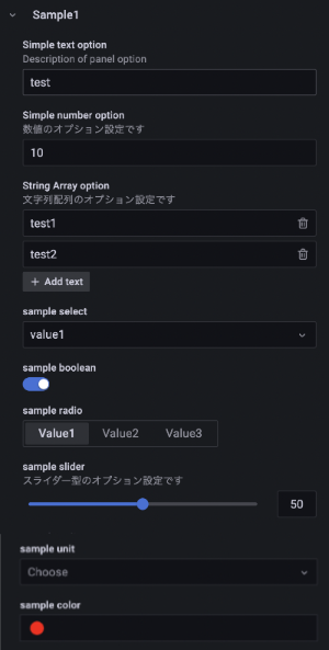
使用できるオプションUIビルダー †項目オプション、パネルオプションにカスタム設定を追加する際に利用できるUIビルダーは、ここら辺を見ればおおよそ把握出来る。
import { PanelPlugin } from '@grafana/data';
import { SimpleOptions } from './types';
import { SimplePanel } from './components/SimplePanel';

export const plugin = new PanelPlugin<SimpleOptions>(SimplePanel).setPanelOptions((builder) => {
  return builder
    .addTextInput({
      path: 'sampleText',
      name: 'Simple text option',
      description: 'Description of panel option',
      defaultValue: 'test',
    })
    .addNumberInput({
      path: 'sampleNumber',
      name: 'Simple number option',
      description: '数値のオプション設定です',
      defaultValue: 10,
    })
    .addStringArray({
      path: 'sampleStrings',
      name: 'String Array option',
      description: '文字列配列のオプション設定です',
      defaultValue: ['test1', 'test2'],
    })
    .addSelect({
      path: 'sampleSelect',
      defaultValue: 'value1',
      name: 'sample select',
      settings: {
        options: [
          {label: 'value1', value: 'Value1'},
          {label: 'value2', value: 'Value2'},
          {label: 'value3', value: 'Value3'},
        ]
      },
    })
    .addBooleanSwitch({
      path: 'sampleBoolean',
      name: 'sample boolean',
      defaultValue: false,
    })
    .addRadio({
      path: 'sampleRadio',
      name: 'sample radio',
      defaultValue: 'value1',
      settings: {
        options: [
          { value: 'value1', label: 'Value1'},
          { value: 'value2', label: 'Value2'},
          { value: 'value3', label: 'Value3'},
        ],
      },
      showIf: (config) => config.sampleBoolean,
    })
    .addSliderInput({
      path: 'sampleSlider',
      name: 'sample slider',
      description: 'スライダー型のオプション設定です',
      defaultValue: 0,
      settings: { min: 0, max: 100, step: 1},
    })
    .addUnitPicker({
      path: 'sampleUnit',
      name: 'sample unit',
    })
    .addColorPicker({
      path: 'sampleColor',
      name: 'sample color',
      defaultValue: '#ff0000',
    });
});
type SampleValues= 'value1' | 'value2' | 'value2';

export interface SimpleOptions {
  sampleText: string;
  sampleNumber: number;
  sampleStrings: [string];
  sampleSelect: string;
  sampleBoolean: boolean;
  sampleRadio: SampleValues;
  sampleSlider: number;
  sampleUnit: string;
  sampleColor: string;
}
実際のオプション設定値は引数 options から取得可能。 import React from 'react';
import { PanelProps } from '@grafana/data';
import { SimpleOptions } from 'types';
interface Props extends PanelProps<SimpleOptions> {}
export const SimplePanel: React.FC<Props> = ({ options, data, width, height }) => {
return (
<div>
<div><div style={{display: 'inline-block'}}>options.sampleText</div>: <div style={{display: 'inline-block'}}>{options.sampleText}</div></div>
<div><div style={{display: 'inline-block'}}>options.sampleNumber</div>: <div style={{display: 'inline-block'}}>{options.sampleNumber}</div></div>
<div><div style={{display: 'inline-block'}}>options.sampleSelect</div>: <div style={{display: 'inline-block'}}>{options.sampleSelect}</div></div>
<div><div style={{display: 'inline-block'}}>options.sampleStrings</div>:<div style={{display: 'inline-block'}}>{options.sampleStrings.join(',')}</div></div>
<div><div style={{display: 'inline-block'}}>options.sampleBoolean</div>:<div style={{display: 'inline-block'}}>{options.sampleBoolean ? 'true' : 'false'}</div></div>
{options.sampleBoolean && (
<div>options.sampleRadio: {options.sampleRadio}</div>
)}
<div><div style={{display: 'inline-block'}}>options.sampleSlider</div>: <div style={{display: 'inline-block'}}>{options.sampleSlider}</div></div>
<div><div style={{display: 'inline-block'}}>options.sampleUnit</div>: <div style={{display: 'inline-block'}}>{options.sampleUnit}</div></div>
<div style={{color: options.sampleColor}}>
<div style={{display: 'inline-block'}}>options.sampleColor</div>: <div style={{display: 'inline-block'}}>{options.sampleColor}</div>
</div>
</div>
);
};
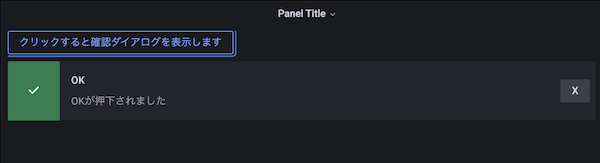
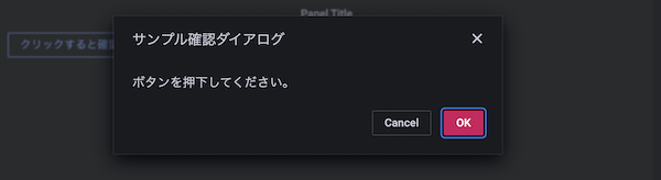
独自のパネルオプション †また、addCustomEditor を使用して、独自のパネルオプションを構築する事も可能。 Grafana コンポーネントの利用 †ボタンなどの各種UI部品は Grafana の UIコンポーネントを利用する事が出来る。 Storybook が用意されているので、これを参照して各種UIコンポーネントを独自パネルに組み込む。
import React, { useState } from 'react';
import { PanelProps } from '@grafana/data';
import { Alert, Button, ConfirmModal } from '@grafana/ui';
import { SimpleOptions } from 'types';

interface Props extends PanelProps<SimpleOptions> {}

export const SampleGrafanaUI: React.FC<Props> = ({ options, data, width, height }) => {

  const [showModal, setShowModal ] = useState(false);
  const [message, setMessage] = useState<any>({});

  return (
    <div>
      <Button
        size="md"
        variant="success"
        fill="outline"
        tooltipPlacement="top"
        onClick={()=>{
          setMessage({});
          setShowModal(!showModal);
        }} >
        <div>クリックすると確認ダイアログを表示します</div>
      </Button>
      <ConfirmModal
        isOpen={showModal}
        title="サンプル確認ダイアログ"
        body="ボタンを押下してください。"
        confirmText="OK"
        onConfirm={() => {
          setMessage({title: 'OK', severity: 'success', text: 'OKが押下されました'});
          setShowModal(false);
        }}
        onDismiss={() => {
          setMessage({title: 'キャンセル', severity: 'info', text: 'キャンセルされました'});
          setShowModal(false);
        }}
      />
      <div style={{marginTop: 10}}>
        {message?.text
          ? (
              <Alert
                title={message.title}
                severity={message.severity}
                buttonContent="X"
                onRemove={()=>setMessage({})}
                >
                {message.text}
              </Alert>
            )
          : null}
      </div>
    </div>
  );
};
|
 sample_options.png 162件
[詳細]
sample_options.png 162件
[詳細]
 sample_grafanaui3.png 159件
[詳細]
sample_grafanaui3.png 159件
[詳細]
 sample_grafanaui2.png 151件
[詳細]
sample_grafanaui2.png 151件
[詳細]
 sample_grafanaui1.png 166件
[詳細]
sample_grafanaui1.png 166件
[詳細]
 create-dashboard5.png 147件
[詳細]
create-dashboard5.png 147件
[詳細]
 create-dashboard4.png 160件
[詳細]
create-dashboard4.png 160件
[詳細]
 create-dashboard3.png 148件
[詳細]
create-dashboard3.png 148件
[詳細]
 create-dashboard2.png 158件
[詳細]
create-dashboard2.png 158件
[詳細]
 create-dashboard1.png 144件
[詳細]
create-dashboard1.png 144件
[詳細]


